
Getting Started with Unity for Mobile Games
We’ll walk you through setting up your first project, understanding the editor, and building a playable prototype in a few hours.
Read Article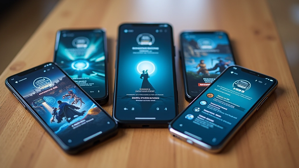
Common mistakes we see in game UIs — buttons too small, text unreadable, menus confusing. Here’s what we’ve learned about designing for different screen sizes.
You’re not designing for a desktop anymore. Your player’s got one thumb. They’re probably in a crowded coffee shop. Their screen’s 5-6 inches wide, and they’ll abandon your game in 3 seconds if the interface gets in their way.
It’s not about making things look pretty — it’s about making things work. We’ve built over 15 games in the last 8 years, and we’ve learned what works and what doesn’t. This article covers the real mistakes we’ve fixed, the patterns that stick around, and the specific techniques we use now.
Here’s the first mistake: making buttons that look good in mockups but feel tiny on an actual phone. Apple recommends 44×44 pixels minimum. We use 48×48 as our baseline, and honestly, we’ve found 56×56 is better for action buttons.
Why? Because your players aren’t sitting at a desk with a mouse. They’re moving. The bus is bumpy. They’re playing with one hand while holding coffee. A button that’s technically tappable isn’t the same as a button that’s easy to tap when you’re distracted.
We don’t just size buttons — we also space them. 16-24 pixels between buttons prevents accidental taps. That gap isn’t wasted space, it’s user safety. Plus, we add visual feedback. When someone taps a button, something changes immediately. Not a second later. Immediately.
We see this constantly: beautiful 12-point font in the design tool. Looks fine on a 27-inch monitor. Looks like ant legs on a phone. Minimum font size for body text is 16 pixels. For UI labels, 14 pixels minimum. Headers? Start at 24 pixels and scale from there.
But it’s not just size. It’s contrast. Light gray text on white background? That fails accessibility standards, and your players will miss it. We use #1e293b text on light backgrounds and #f1f5f9 on dark ones. WCAG AA compliant. You can check contrast with tools like WebAIM.
Font choice matters too. Stick with system fonts when you can. They render crisper on mobile than custom fonts, especially at small sizes. If you use custom fonts, test them on real devices. That beautiful serif font might blur at 14px on a Samsung.


Don’t try to cram desktop layouts onto a phone. We use a few proven patterns: single column for main content, tab bar at the bottom for navigation (reachable with one thumb), and modal overlays for secondary actions.
The bottom tab bar changed everything for us. Players can tap without reaching across the screen. We keep it to 4-5 tabs maximum. Any more than that and people get lost. Each tab has an icon plus a label — icons alone aren’t enough.
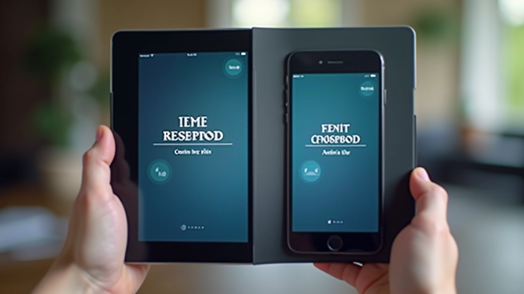
And this is important: test on different phones. A layout that works on an iPhone 14 might be cramped on an older Android with a notch. We test on 3 devices minimum: a small phone (5.4″), a standard phone (6.1″), and a larger phone (6.7″).
This article provides educational information about mobile game interface design principles and best practices. Every project has different requirements, and what works for one game might need adjustment for another. The techniques described here are based on our experience with mobile game development, but your specific implementation should account for your target audience, device capabilities, and performance constraints. Always test your UI on real devices with real players before launch.

A beautiful UI that takes 2 seconds to open is a bad UI. We keep animations under 300 milliseconds. Transitions between screens? 150-200ms. Anything longer and it feels sluggish, even if the code is efficient.
We also avoid heavy shadows and blur effects on budget phones. They look great on a flagship device, but they’ll tank your frame rate on a 4-year-old phone. And yes, people still play games on 4-year-old phones. That’s a significant portion of your potential player base.
The rule we follow: design for the minimum device you want to support. If you’re targeting Android 6.0+, test on a device running that version. Don’t assume modern phones. Make it work there first, then add polish for newer devices.
Mobile UI design isn’t about being clever. It’s about being considerate. Your players are using one thumb. Their attention spans are short. They’ve got 10 other games installed. Make it easy for them to play, and they’ll stick around. Make them work, and they’re gone in seconds.
Start with touch targets that are actually tappable. Use text that’s actually readable. Pick layouts that fit the screen. Test on real devices. That’s 80% of good mobile UI design right there.
The other 20%? That’s learning from your players. Release your game, watch how people actually use it, and iterate. The best UI designers aren’t the ones with the best taste — they’re the ones who listen to how people actually play.